I'll say right off that I don't know how to create a great book cover. What I want to explore in this post is my thinking behind the evolving cover for my first novel, Of Fish and Swimming Swords.
When self-publishing, you have to provide covers for each of the formats you're publishing. If an electronic edition, you'll need the equivalent of a front cover. If going with a POD edition, you'll need the front, spine, and back of the cover. Usually, you want the electronic cover to be a version of the POD cover. For my covers, I'm using Inkscape for vector drawing and the GIMP for final composition and effects. Both are free, open source applications that have versions for Microsoft Windows, OS X, and most UNIX/Linux distributions.
The first rule of writing is that money always flows to the author, never away. When self-publishing, this is true to the extent that you don't need to pay someone else to do something for you. The one thing you must never pay for is the opportunity to be published. It's one thing to have to pay for a copy of your novel. It's another to have to buy a minimum number of copies in exchange for getting published. The publisher must not require anything that costs you money in order to publish.
Cover design and book layout can be done by yourself if you are publishing through a reputable self-publisher, especially if publishing electronically. However, if you aren't good with graphics or typesetting, there's no harm in paying someone else to do the work for you as long as there's no conflict of interest with the publisher. You should never feel compelled to use an artist or typesetter recommended by the publisher.
Almost every book or article talking about writing says that you need to capture the reader in the first sentence. You want to hook the reader so they always want to know what's next. You want them to feel compelled to turn the page. At the end of a chapter, you want them to feel that things are unresolved. You don't want them coming to the end of a chapter feeling that they've reached a good stopping point.
Before they get to the first sentence, though, they see the cover of the book. The cover needs to be inviting and just enticing enough that they will want to see the first sentence. Covers say things about the book. To make a good cover, you need to know what you're saying when you design it, and you need to know what reader's might think. This is just like writing, but it's visual instead of textual.
Questions We Want to Ask
Take a moment and read Top 8 Cover Design Tips for Self-Publishers. Reviewing the tips, we have the following questions we need to ask of our cover:
- Does the cover convey science fiction?
- Does the cover convey a sense of searching and mystery?
- Does the cover convey the surreal ambience of much of the novel?
- Can we remove an element of the cover and still have it work?
- Do we have a background that will work on a white screen?
- Can we read the title on the thumbnail version?
- Is the title easy to read?
- Does the imagery clarify what the reader can expect?
- Do we have too many colors?
First Attempt
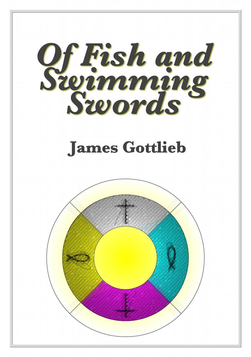
Let's take a look at my first attempt at a cover for my novel in light of the above questions. This is my second draft of this style. I changed the background from black to white. We'll take a look at a dark version after this one.
The cover doesn't really speak to science fiction specifically. Someone might connect the symbol with something religious or mystical, which would be accurate as far as the symbol itself went, but wouldn't be representing the genre accurately. The mysticism that comes with the symbol might convey a sense of mystery and searching, but only in the sense that mysticism is about mystery and searching.
There are a lot of things here that we could take out. The texturing of the symbol and lighting that makes it look almost like a lifesaver candy. The background yellow gradient. In some ways, the graphics have been overdone to the point of being an amateurish exercise of a graphics program. While I only have four basic colors, I have gradients and shading all over the place in the symbol, and no color anywhere else.
The title actually is readable in the thumbnail, but just barely. I like the script and the way I could connect the 'S' in Swimming with the 'f' in Of. It's like a ligature, but across lines instead of adjacent letters.
Zero-eth Attempt
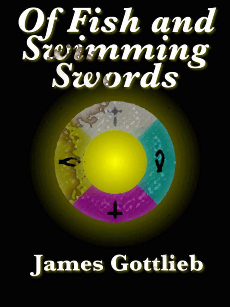
I said that the white cover above was my first attempt, and that's mostly true. I did an earlier version with a black background before changing to a lighter, white background that I felt was a bit friendlier.
I like the symbol better in this version. It's a little more abstract. The coffee stains help it blend in with the rest of the cover. The only problem with the stain images is that I'd rather they be blood than coffee. Even though no blood appears in the book, the idea of mystery and mayhem are suggestive of what the novel is about. This version also works well as a thumbnail, though the coffee stain might make some of the text a little difficult to read.
Even though I've moved on to a completely different composition of symbols for my second cover draft, I might return to this idea if I feel my current version isn't going to work. However, that will mean that I will need to figure out how to reproduce the symbol design here as well as get the coffee stains to work at 600 dpi. The GIMP plugin crashed last time I tried it at that resolution, but 600 dpi is really the lowest resolution you should do a cover for POD use. POD publishers say you shouldn't go below 300 dpi, but that's because 300 dpi is the bare minimum for printing that looks smooth when viewed from a foot or two away. I'm hoping to work at 1200 dpi if I can get the GIMP to manage it.
Second Attempt
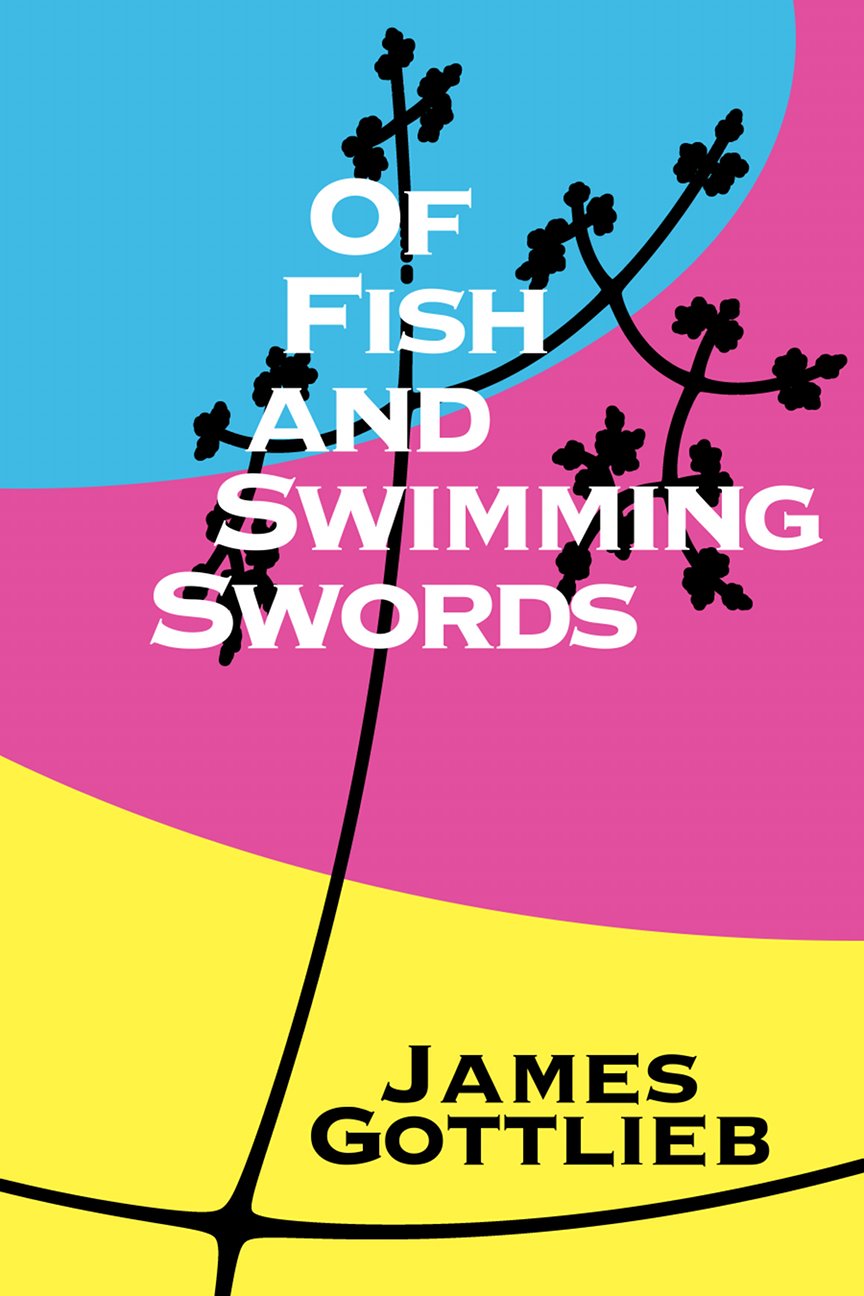
My second attempt was a completely different view of what the cover should be showing. Instead of going for something that was literal to the text, I went with a design that captured the concepts of the novel without showing anything really from the novel.
The style makes me think of the late sixties and early seventies. It's very abstract, with the blue and maroon playing the part of the sky, and the yellow being the ground. The tree is a fractal that represents the computational aspect of the tree portrayed in the book. The boundary between the blue and maroon mirrors the arc of the tree branches without following it exactly. The other choice was to cut across the branches.
I'm not happy with the title yet. The font is reasonable given the other design elements, but I think it vibrates with the other elements behind it. I want to mirror the flow of the tree and color boundaries with the flow of the title, but I may need to cut across the other lines to make it work.
Of all of the covers, I think this one gets the most things right with respect to the eight tips we read earlier. It's a bit mysterious without committing to anything specific. It's surreal in a way that parts of the novel are surreal. It's representative without being concrete.
What do you think? Do you have a favorite of the three? What tweaks do you think I should try?
